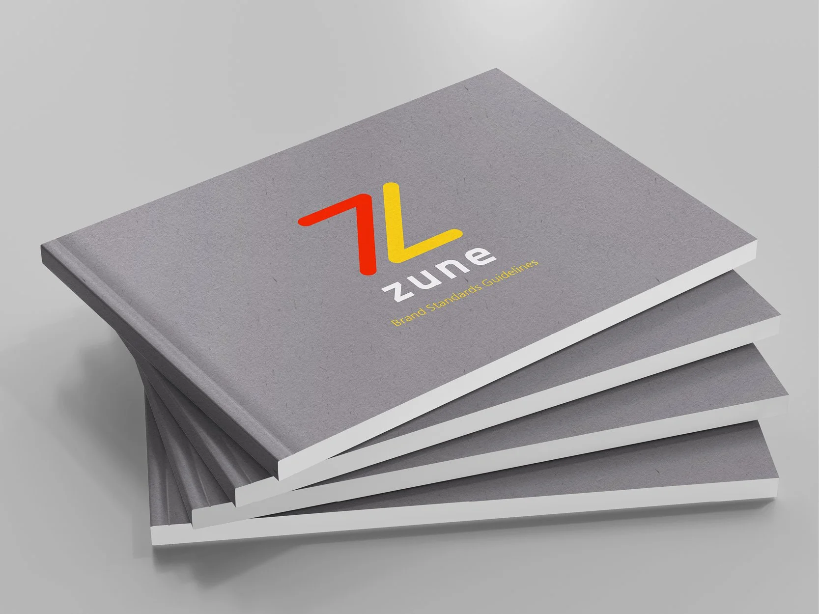
Zune
Corporate Rebrand
Adobe Illustrator, Adobe Photoshop, Adobe InDesign
A brand refresh for the defunct “Zune” brand. This concept re-envisions the Microsoft subdivision if it were to be revived today as a platform for streaming high-fidelity media.
Original Branding & Proposed Rebrand
The original Zune brand identity emphasized the connectedness of Zune products through a series of dynamic, interconnected lines which were highlighted with an energetic gradient. While this approach is certainly energetic, the logo is rather complex, making it difficult to remember vividly.
The updated Zune brand identity aims to continue to push the sense of energy and interconnectedness established by its predecessor, while simplifying the overall presentation of the “Z” shaped mark. These adjustments revitalize Zune as a brand and ensure a more memorable identity system.
Concepts & Sketches
Several possible directions were explored during initial development, with a particular emphasis on energetic diagonal lines, and other iconography associated with music and media playback.
Typography & Color Palette
Typographical selections emphasize the new minimalist approach of the Zune brand, while still exhibiting expressive qualities that music lovers appreciate. Two typefaces were chosen that compliment the qualities of updated brandmark, and work together to reflect Zune’s “tech-based” service Do Heyon is utilized for Logotype and display purposes while Nanum Gothic is used at various weights, making it ideal for body copy.
Vibrant warm colors were paired with neutral grays to give the brand a compelling sleek yet energetic appeal.


